
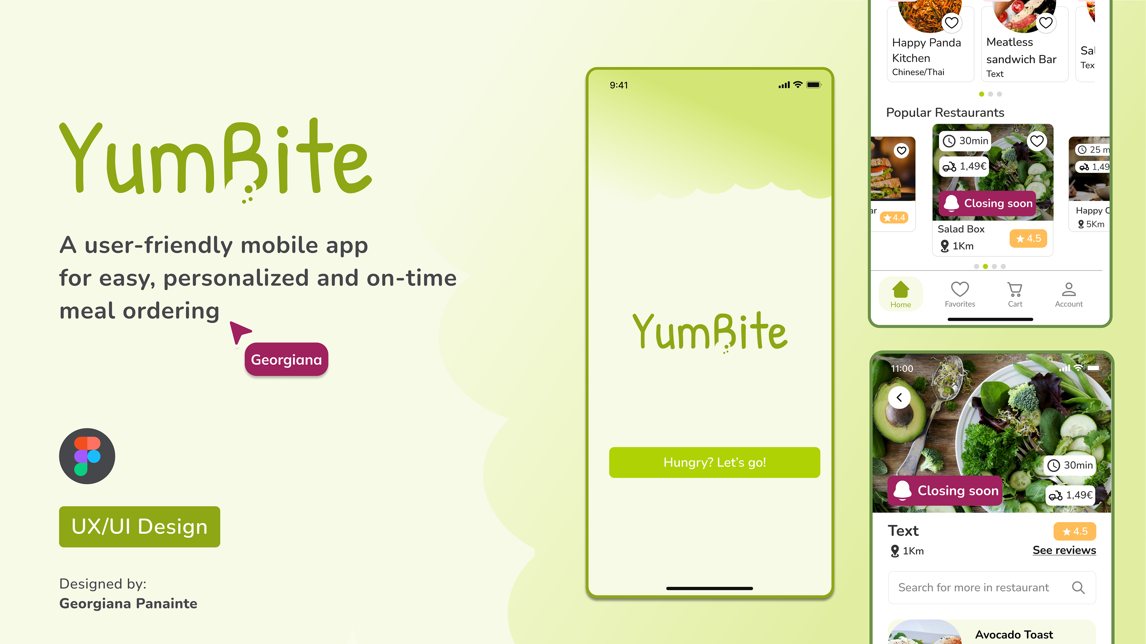
YumBite
a user-friendly mobile app for personalized, and on-time meal ordering.
Duration: 8 weeks
Tools: Figma, Google Drive, Zoom
Tools: Figma, Google Drive, Zoom
Skills: User research, sketching, wireframing, prototyping, and user testing.
USER PROBLEM
Busy professionals need online meal orders to arrive on time so they can focus on work, meetings, or learning without interruptions.
I wanted to understand the common problems people encounter when ordering food online, especially in the fast-paced world of food delivery services. As someone who regularly uses these services, I was curious to see how others experience this sector.
GOAL STATEMENT
To offer users a solution to schedule meal delivery times, granting them the flexibility to enjoy fresh food at their preferred hour.
1. UNDERSTANDING THE USER
RESEARCH GOAL
To explore the preferences and challenges faced by individuals with busy schedules when ordering meals online.
USER INTERVIEWS
Users prioritize having more control over their online meal orders, particularly the ability to select their preferred delivery times.
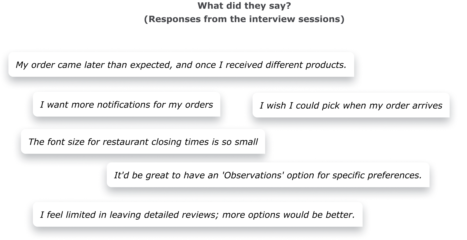
I conducted 5 user interviews through video calls with individuals from Romania who regularly order food online at least twice a week.
AFFINITY MAPPING
Affinity mapping was used to organise the notes and thoughts from the interviews and uncover an underlying pattern among the participants. I categorized the information we got from the in-depth interview.
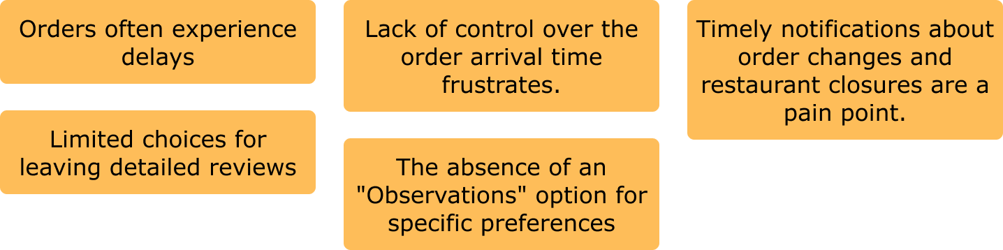
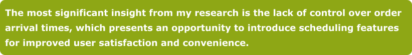
INSIGHTS
After doing the Affinity Mapping, I many findings, but here are the top ones.
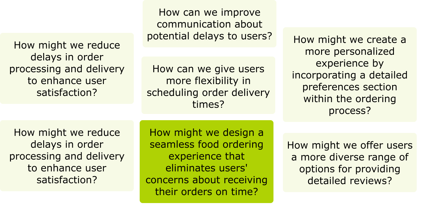
HOW MIGHT WE?
I explored the Insights found and thinking about "How Might We's" related to that. The one I have chosen to focus on is this:
How might we design a seamless food ordering experience that eliminates users' concerns about receiving their orders on time?
How might we design a seamless food ordering experience that eliminates users' concerns about receiving their orders on time?
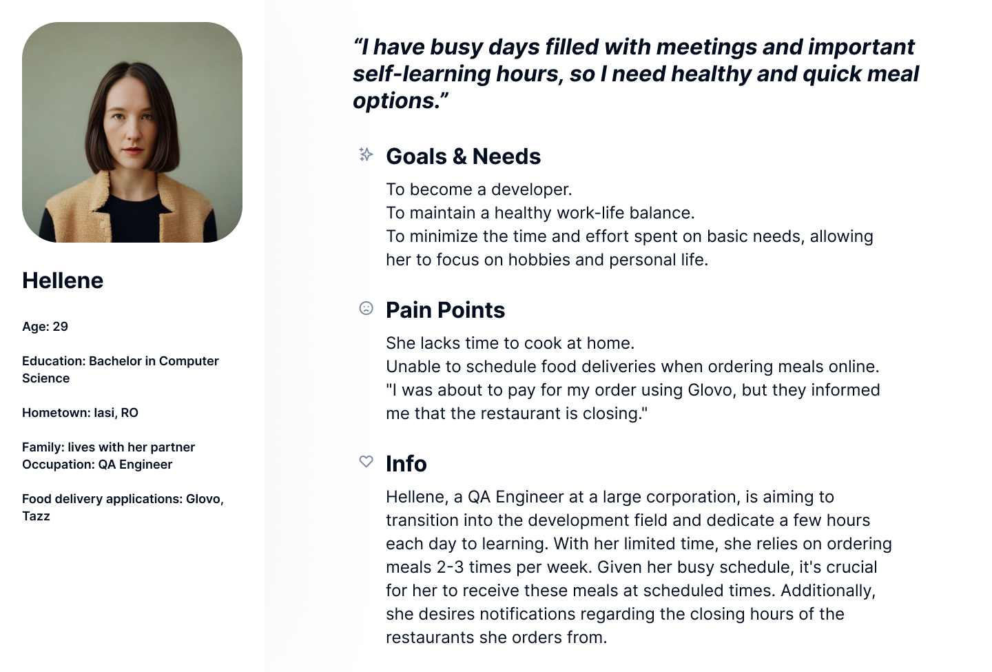
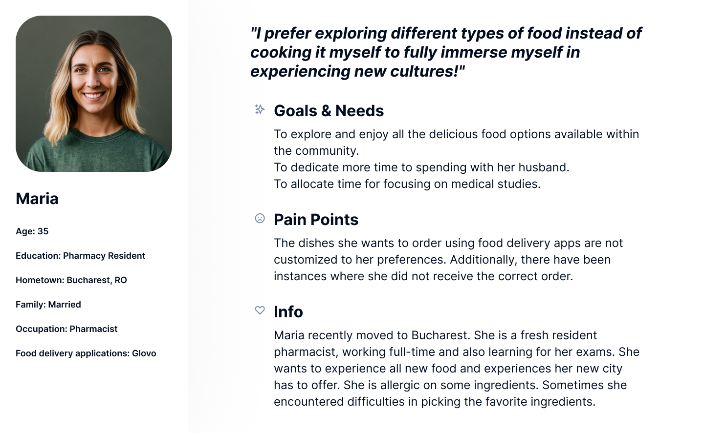
PERSONAS
Now that I've conducted research and gained an understanding of users and their pain points, I created personas. In this phase, I identified the most common themes in the data and grouped users who personify those themes together. This is how I created Hellene and Maria.
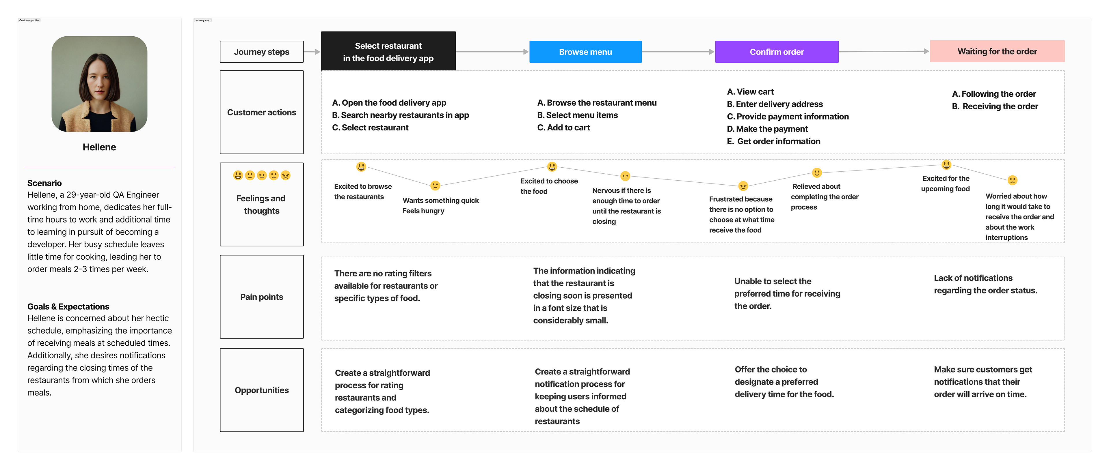
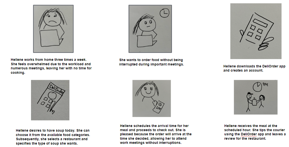
USER JOURNEY
I created Hellene's journey of ordering food online during her career change and busy schedule. This picture shows each step Helene takes, giving me ideas on how to make the experience better.
Opportunities:
Rate restaurants & categorize food.
Notify about restaurant schedules.
Choose preferred delivery times.
Ensure timely order notifications.
Notify about restaurant schedules.
Choose preferred delivery times.
Ensure timely order notifications.
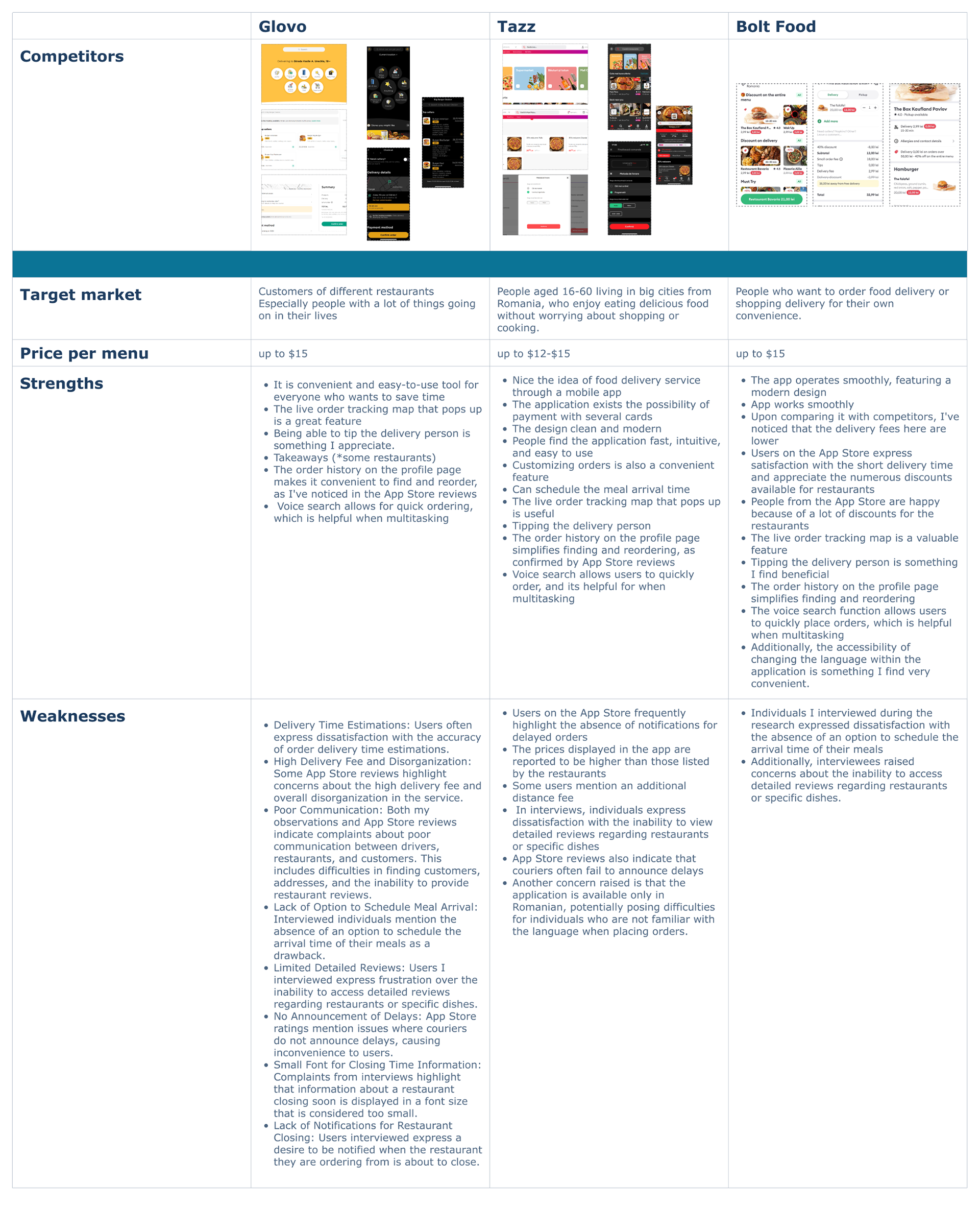
COMPETITIVE AUDIT
Goal: To compare the ease of ordering food on competitor’s apps.
I analysed my competitors' apps from Romania market in 2022 and gained valuable insights through research, creating a competitive audit spreadsheet, synthesizing data into a report. Navigating the apps personally and considering customer reviews on the App Store, I summarized the findings in a structured table, identifying areas for improvement and potential enhancements.

RESEARCH CONCLUSIONS
TASK FLOWS
I created 2 tasks, showing the different activities that users can do:
1. Sign up the app, choose a popular restaurant, and check reviews.
2. Order a dish with an extra, schedule the delivery for later, and leave a review.
STORY BOARD - BIG PICTURE
Scenario: Use the delivery app to quickly and easily order meals on schedule
Once I had the insights about users’ needs, behaviours, and pain points, I started storyboarding. Big picture storyboards illustrate how users would interact with the product in a real-life context, focusing on their emotions, needs and pain points.
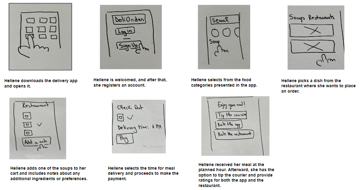
STORY BOARD - CLOSE-UP PICTURE
Scenario: Use the delivery app to quickly and easily order meals on schedule
While big picture storyboards focus on the how and the why, close-up storyboards focus on the what. Close-up picture storyboards show product’s functions rather than the user’s experience and how to navigate from one screen to another.
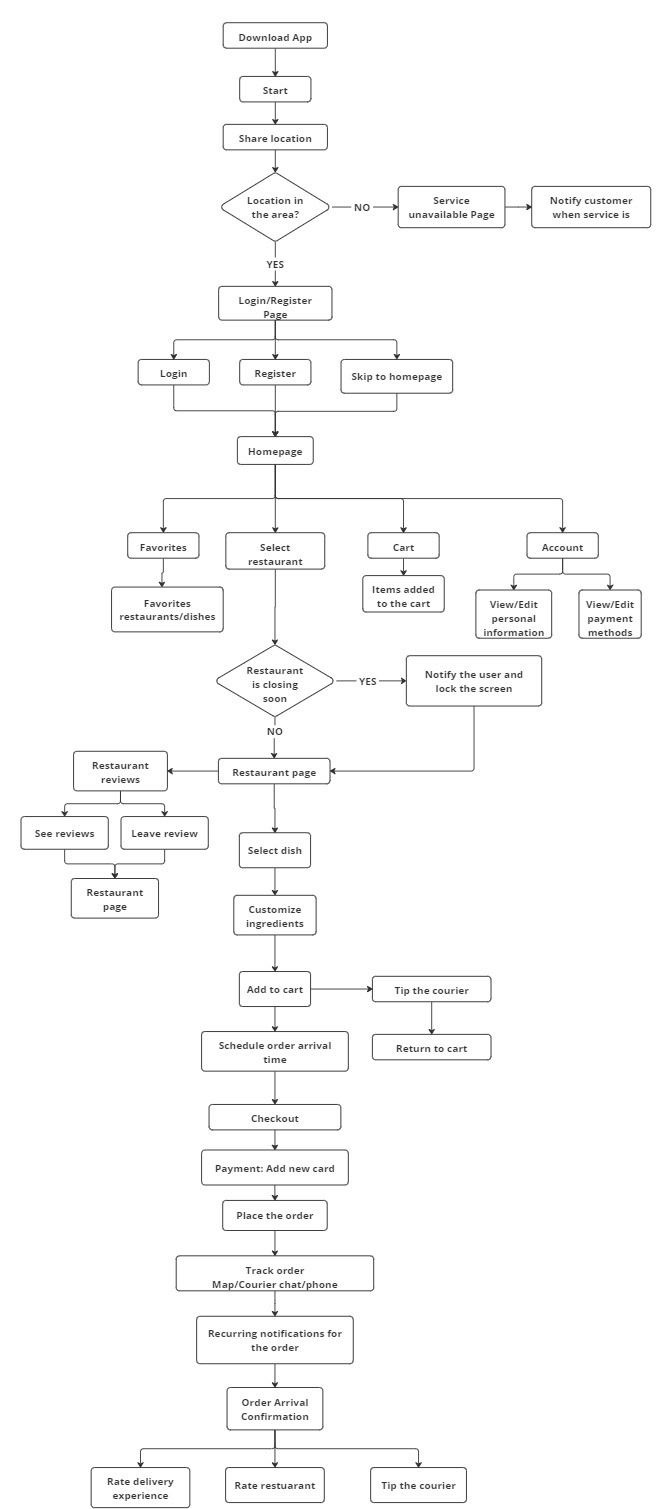
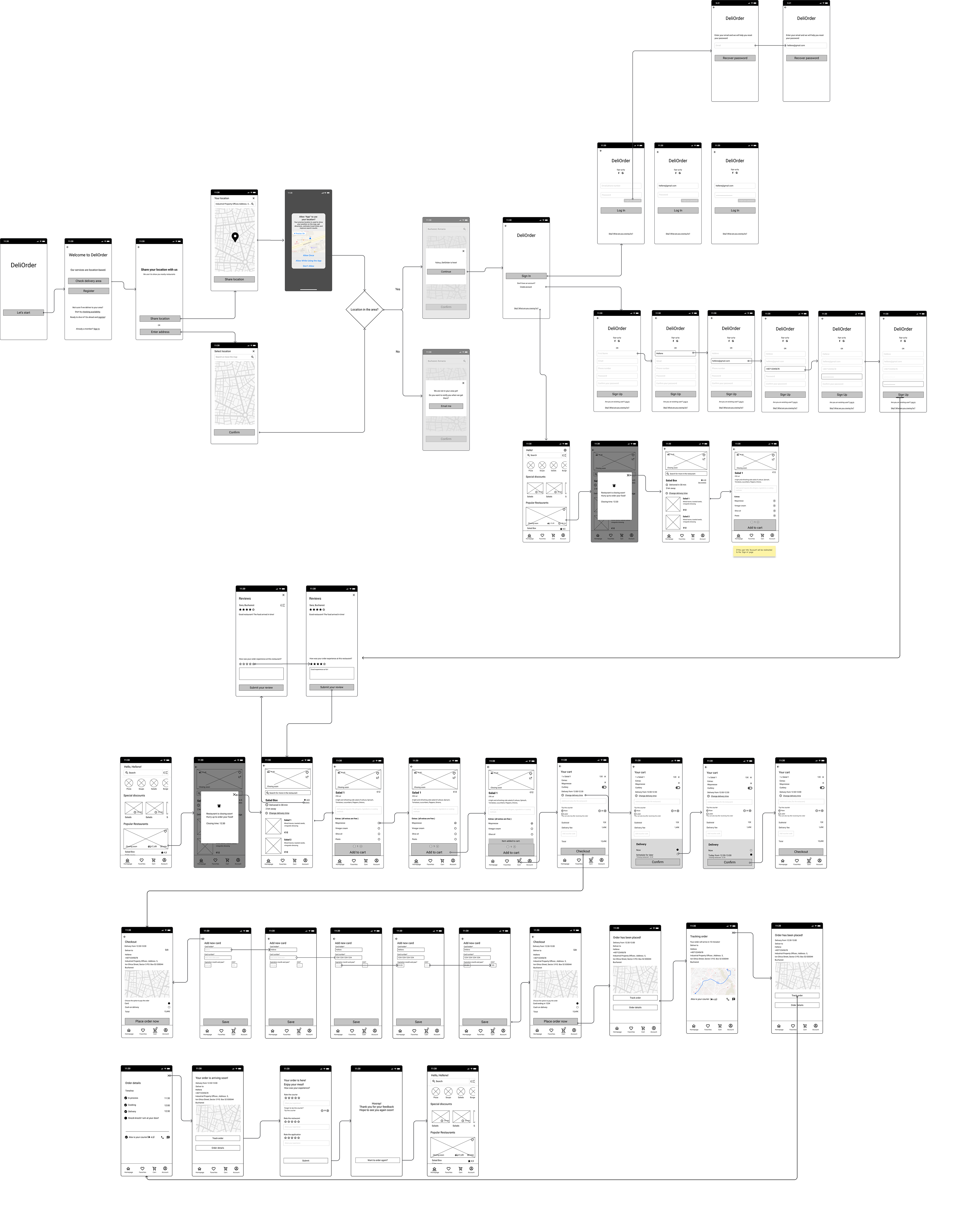
USER FLOW
I created a user flow that illustrates the step-by-step actions users need to take while using the YumBite delivery app.
2. STARTING THE DESIGN
PAPER WIREFRAMES
When I began sketching, my goal was to create numerous designs quickly. This approach allowed me to identify the most effective ideas without becoming super focused on minor details. As I continued sketching, I improved my ability to see which designs would enhance the user experience.
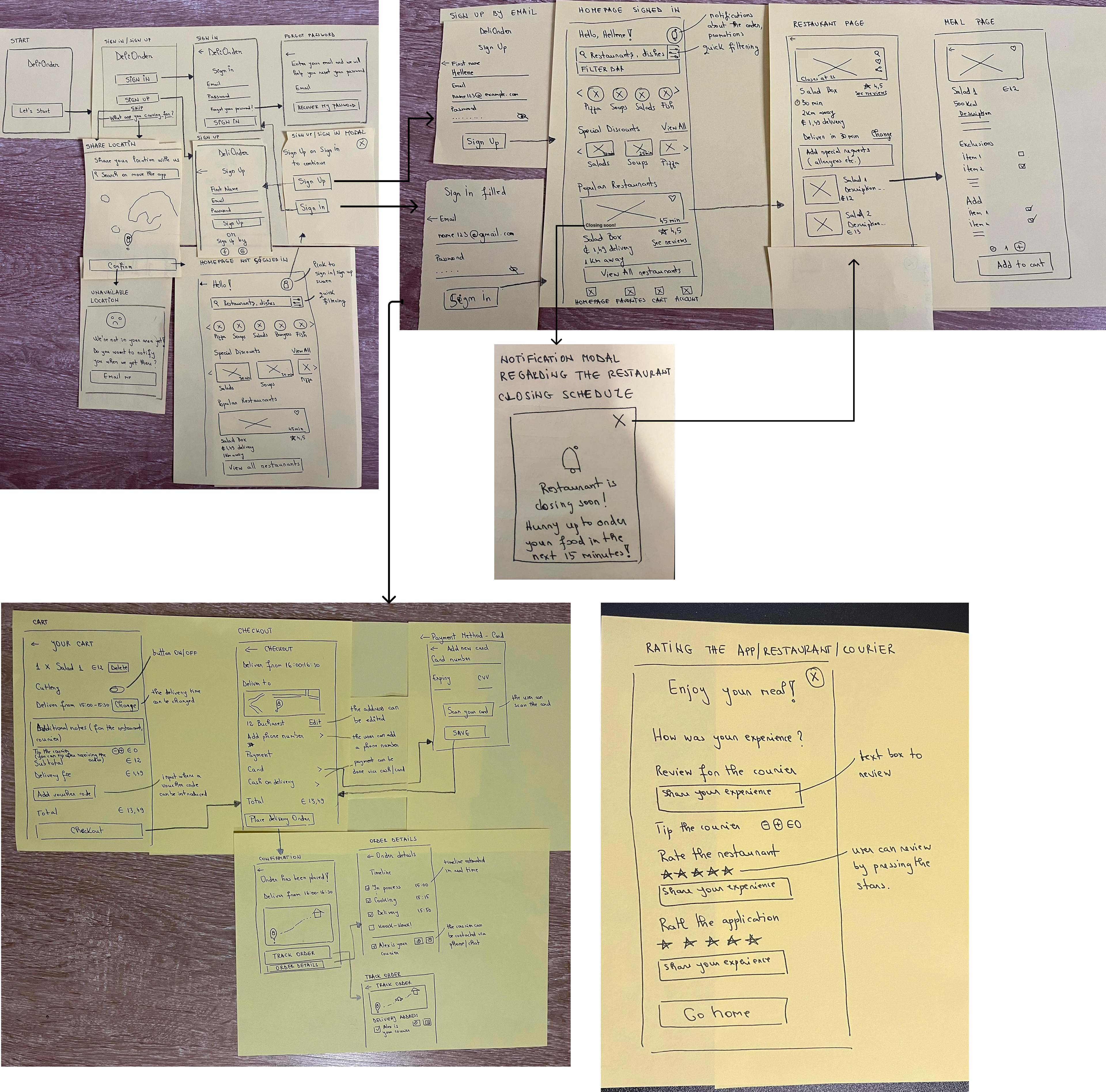
MID-FIDELITY WIREFRAMES
After sketching I created the digital lo-fi wireframes. These wireframes are essential for moving from basic designs to more detailed ones, and for making interactive designs used in usability studies.
USABILITY TESTING
To understand how people would use the app, I asked 5 people to try out the basic prototype in lo-fi wireframes. By watching them and listening to their thoughts, I spotted areas that needed fixing. I took notes and used an affinity diagram to find common patterns in their feedback.
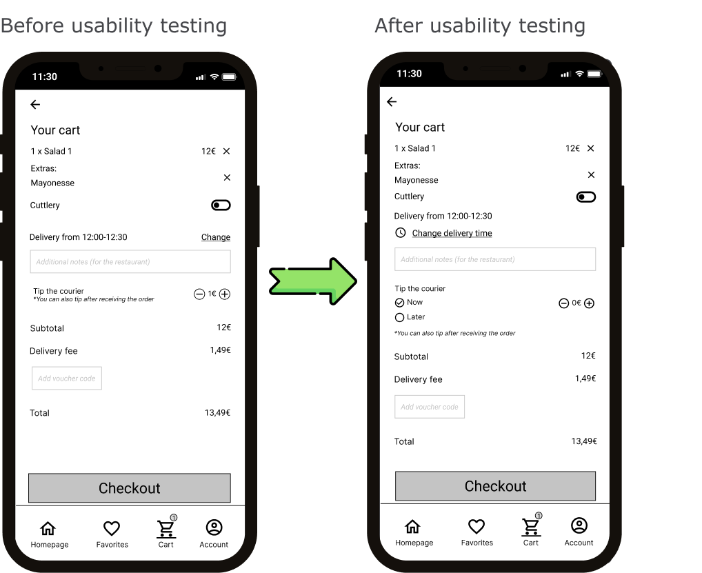
1. Changing the delivery time, a key action in the app, wasn't clear to users during usability testing. I clarified this by modifying the text, highlighting it, and adding an icon to provide more clarity
about this functionality.
Another aspect was the default tipping setting for the courier, which was initially set at 1, causing confusion for users. To make it clearer, I changed the default tip to 0 and provided the
option for users to tip the courier later after receiving the order.
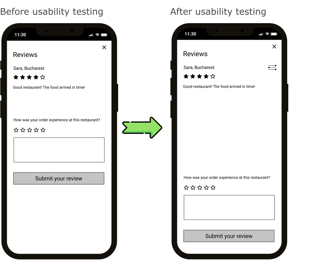
2. In the reviews section, users wanted to easily check the latest reviews or sort them with filters. So, I added a filter icon and
moved the review section down. This not only looks better but also
keeps things intuitive by having all the buttons in the same spot at
the bottom of the page.
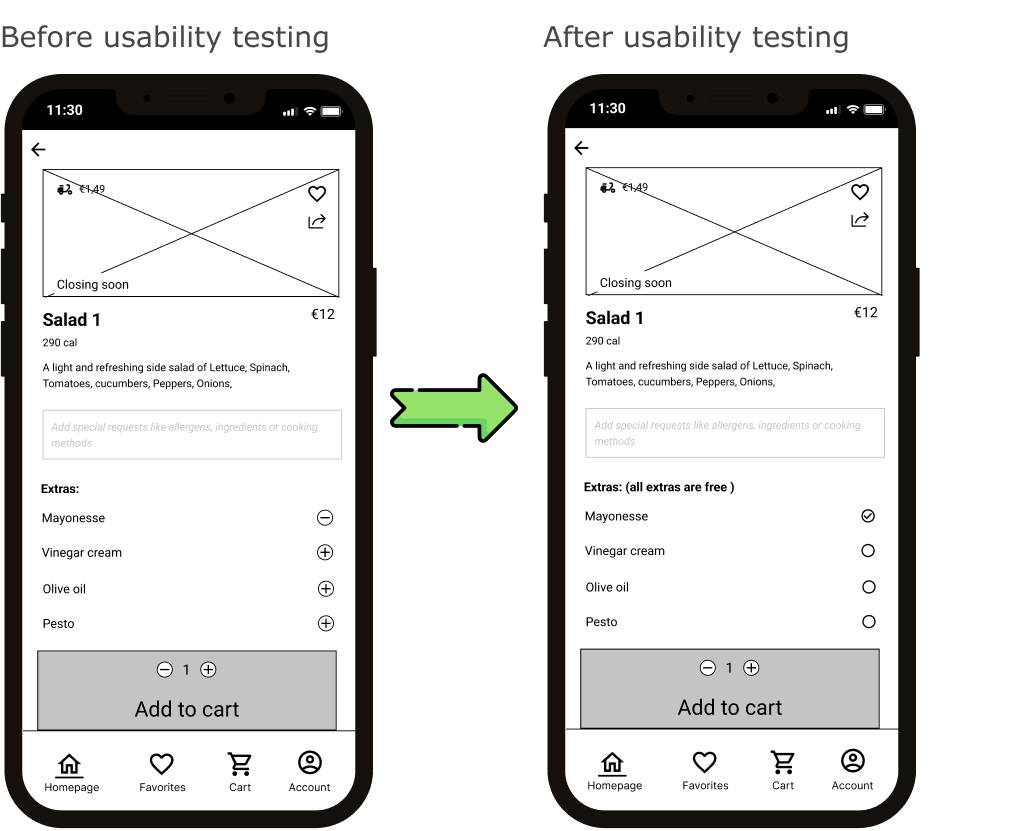
3. The icons to remove or add extras weren't very intuitive for users. Therefore, I replaced them with checkboxes. Additionally, users found it a bit confusing whether they had to pay for the extras, so I included a brief description near the text to provide clarity.
3. REFINING THE DESIGN
MID-FIDELITY WIREFRAMES AFTER USABILITY TESTING
I used the insights from the usability study to make the digital wireframes more user-friendly.
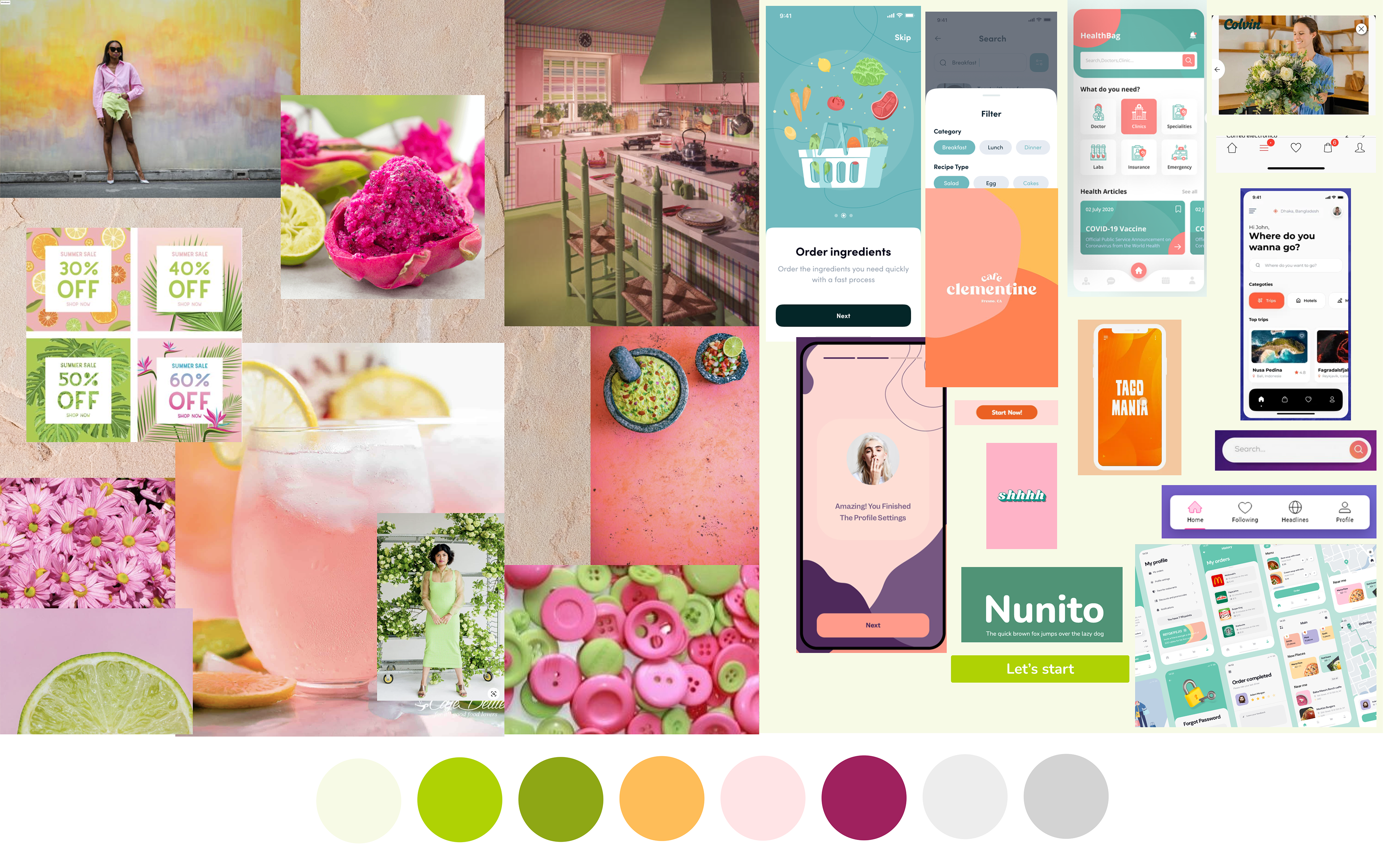
MOOD BOARD AND BRANDING VALUES
I put together this mood board to give the food delivery app a lively and inviting feel. The vibrant colours and playful elements represent an experience in line with the branding values: joyful, welcoming, energetic, youthful, reliable.
THE SOLUTION
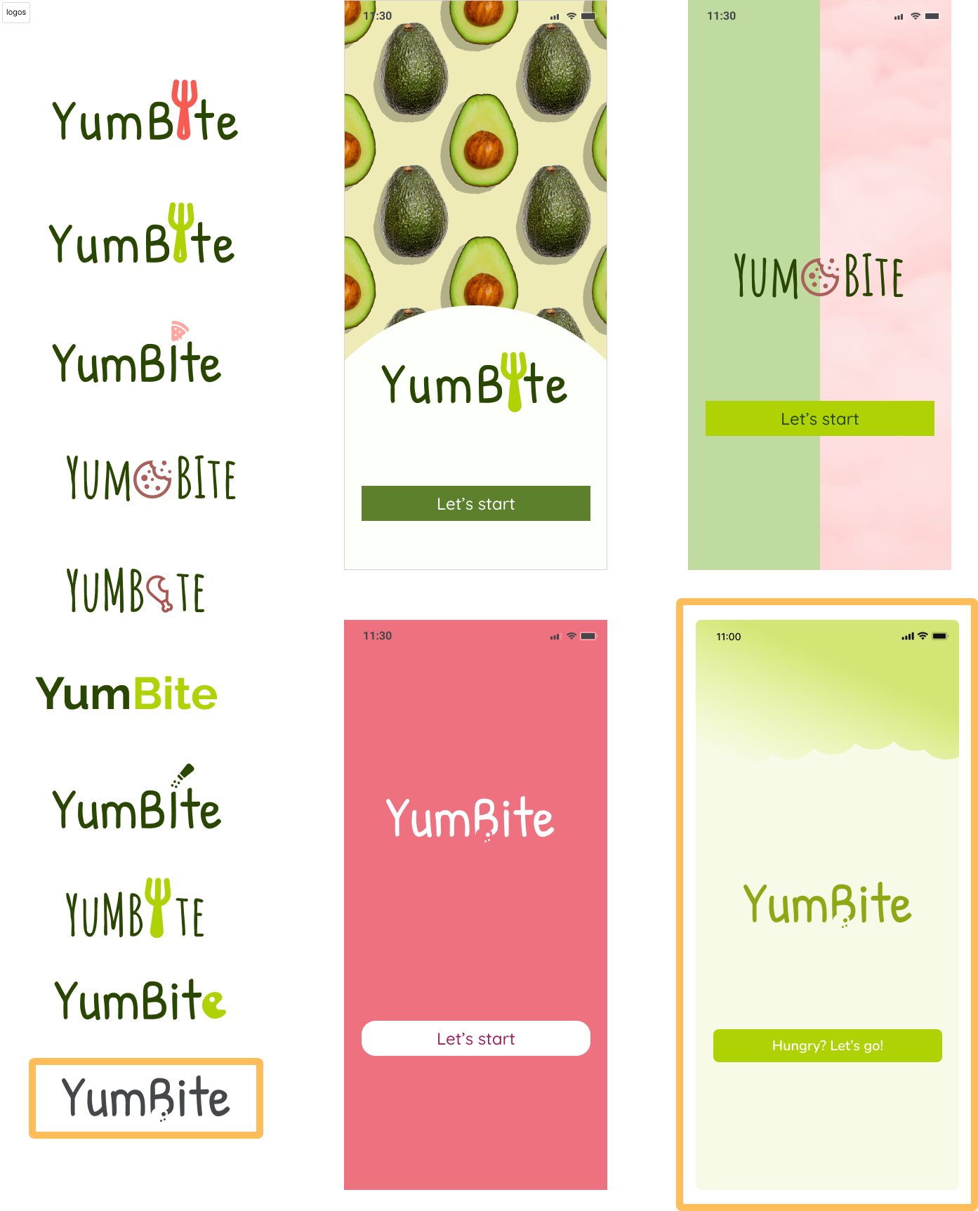
LOGO EXPLORATIONS
In the initial lo-fi wireframes, I named the app DeliOrder.
However, after creating the mood board and establishing the branding values, I decided to change the name to YumBite. This new name better aligns with the branding values: joyful, welcoming, energetic, youthful, and reliable.
The change contributes to a catchy and harmonious overall feel.
I tried out different versions of logos and experimented with various start screen design.
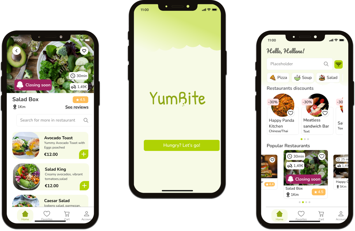
HIGH-FIDELITY WIREFRAMES
1. Sign up the app, choose a popular restaurant, and check reviews
First, the user checks if the delivery app is available in their area, ensuring they don't waste time on unavailable options. Then, they sign up and browse through restaurants, selecting a popular one. Finally, they can view reviews for that restaurant before making a decision.
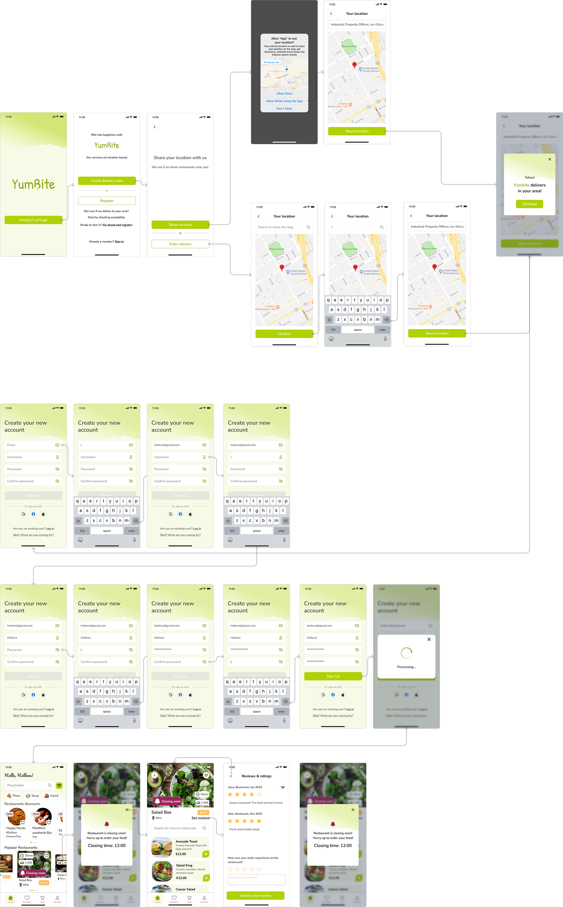
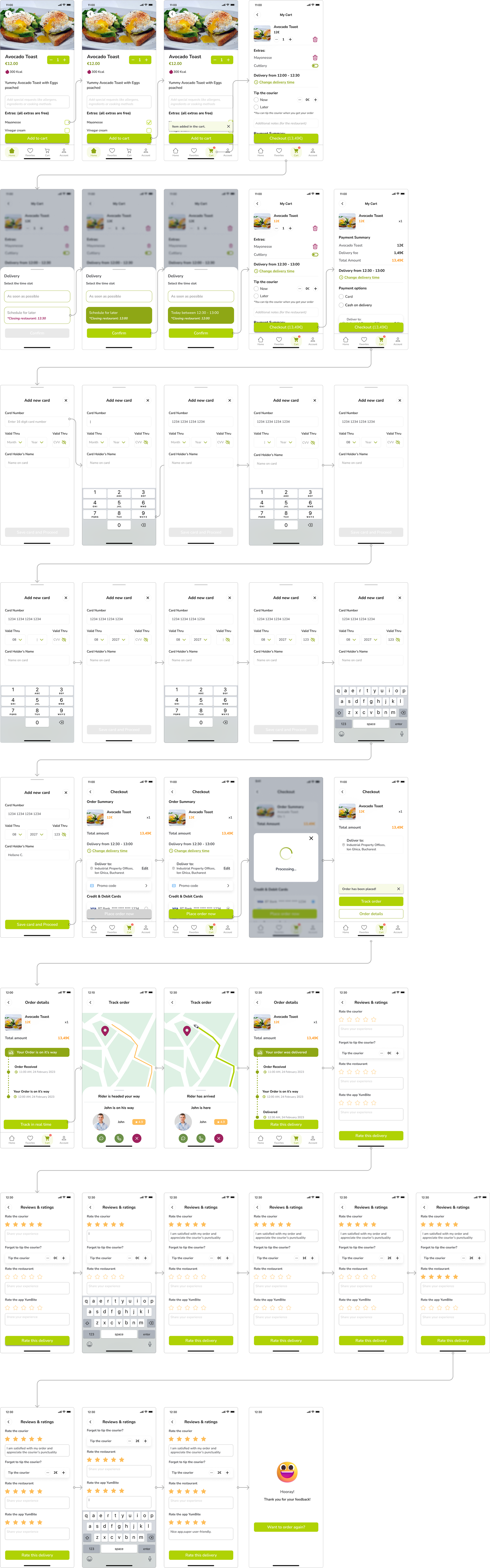
2. Order a dish with an extra, schedule the delivery for later, and leave a review.
First, users can view available extras for each dish, along with any additional costs specified visually. Then, they have the option to schedule the delivery for later. Payment options are intuitive, including card or cash, with the choice to tip the courier during checkout or later. Users can also view the courier's ratings, route, and estimated delivery time, enhancing trust. Finally, after receiving the order, they can provide detailed feedback for the courier, restaurant, and the app.
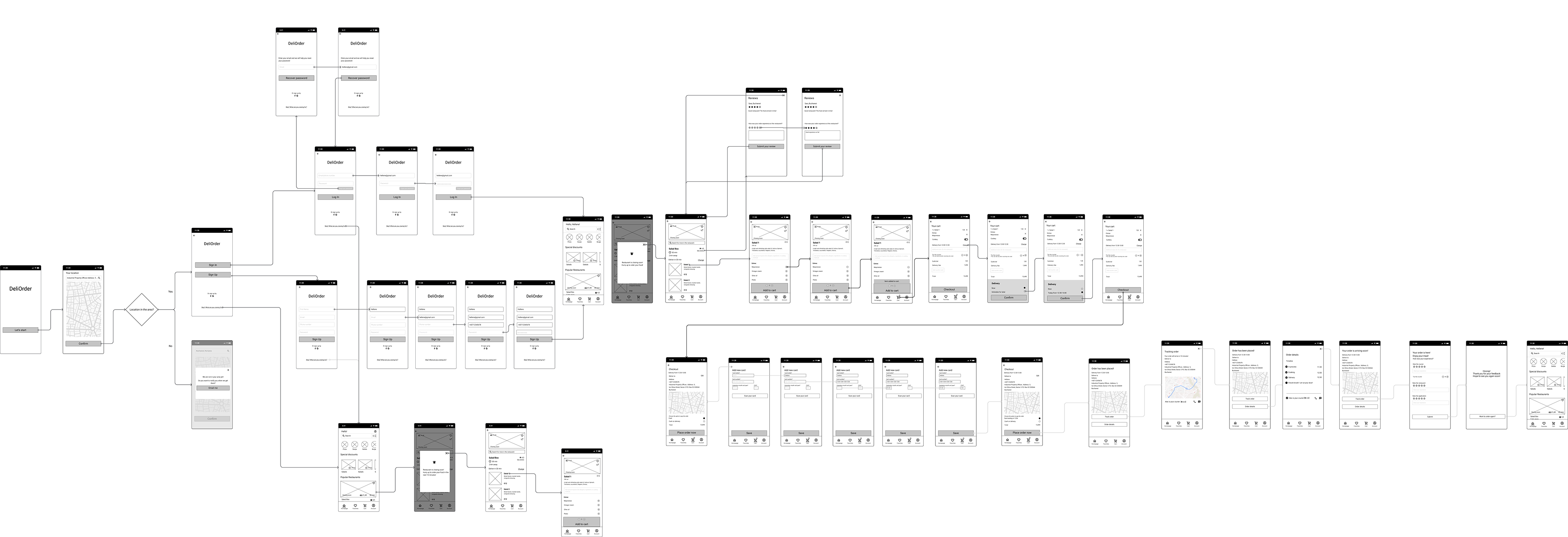
HIGH-FIDELITY PROTOTYPE
I created the prototype that includes these 2 task flows:
1. Sign up the app, choose a popular restaurant, and check reviews.
2. Order a dish with an extra, schedule the delivery for later, and leave a review.
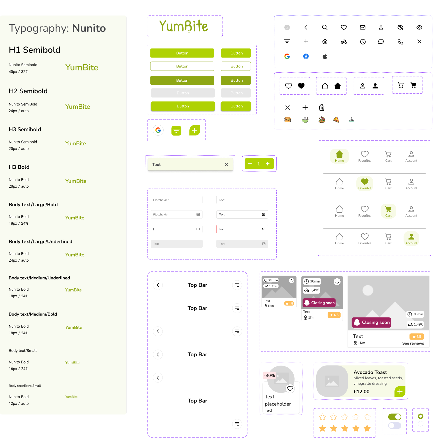
STYLE GUIDE
For typography I chose Nunito sans serif typeface because its characteristics of clarity, friendliness, and readability align perfectly with the values of joy, warmth, energy, youthfulness, and reliability that I wanted to express through the app's design.
CONCLUSIONS AND LEARNINGS
Throughout the project, I conducted user interviews, analysed competitors, developed low-fidelity wireframes, prototyped them, conducted a usability study, and successfully designed high-fidelity UI screens.
While I know there's still room to explore and learn, taking these steps has significantly expanded my understanding of both UX and UI, especially considering that this was my first project fully focused on UX/UI.
NEXT STEPS
- Conducting another usability testing
- Brainstorming and implementing new features